A student's guide to OpenOffice 3.0: Part 1
Foreword
Before the summer, hardly anyone I knew had Office 2007. Now, however, many have bought new laptops for the Fall semester and it’s no surprise that they come preloaded with Office 2007. Combine that with the fact that my new college really likes group presentations and group papers and you get a field study of OpenOffice 3.0 vs Microsoft Office 2007.
Results
Short version: OpenOffice 3.0 is in many ways inferior to Office 2007 and exchanging files has gone from nearly perfect to rather limited. After five weeks I had to bite the bullet and purchase Office 2007.
Long version: It’s not the end of the world and OpenOffice will probably catch up in most areas within a release or two. However, there are several pitfalls I encountered along the way and so I want to present a list here on what is not possible, when it will likely be fixed and how to work around it.
The posts will roughly cover the following topics:
- Styles, Colors and Fonts
- OOXML
- Citations and Sources
- Powerpoint and SmartArt
- Excel vs Calc
Styles, Colors And Fonts
After you have seen half a dozen presentations and papers done in Office 2007 you will notice that they actually did a really nice job of making things look decent. I’m sure within the next five years we will all not be able to stand the default Powerpoint templates but for now they are a welcome change when compared to the often crude looks of Office 2003 and OpenOffice (especially before 3.0).
New fonts embedded in Vista and Office 2007 have been a major factor in improving visual design by mostly retiring the ancient Arial and Times New Roman combination in favor of Cambria, Calibri etc. These fonts are possibly also the most problematic thing because they cannot easily be patched away.
Here’s why: you cannot get them for free and there are no equivalent substitutes. If you google ‘office 2007 fonts linux’ you will find out a few ways to get them installed but that’s dubious at best. For one, several bloggers point out that you can get the fonts from the free PowerPoint viewer but the license expressly states that use of the fonts is only valid on the Windows operating system. I’m pretty sure that the license I paid for grants me the right to use them outside the virtual machine but without delving into the EULAs I’m not going to speculate. The fonts directly from the manufacturer cost $300 by the way.
Which then leads to the second point: substitutes. As pointed out in this article, fonts that are metrically equivalent matter. For now you’ll either have to pay for the fonts one way or another or resort to less pretty fonts. These will still become the expected standard in the near-term so expect to be the odd one out.
Therefore let’s hope (or start a fundraiser so) that the same things happens that did for the Core Fontspackage. Red Hat paid for the Liberation fonts and they are close enough so that you didn’t have to use the Core fonts if you didn’t want to. I’m not holding my breath, though, since the same firm which did the Liberation fonts worked on the C* fonts from Microsoft.
Better default color schemes are one of the additions that really add to the value of Office 2007 and where OpenOffice definitely needs to catch up. It was certainly possible to create tables which looked just as harmonious and professional in Office 2003 given enough time and talent but these defaults make that possible for the average person.
It just is really nice if you can get from a plain table such as the one on the left to a table such as on the right with just one click:
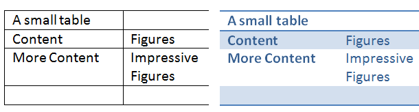
Default colors are a point where it could be comparatively easy to improve the look and feel of open source software but it is often overlooked. Take KOrganizer for example, you could take a look at the KDE/Oxygen color palette and set the colors accordingly and have a really nice looking calendar, similar to how iCal looks really nice on default on OS X, instead of the greenish nightmare that it is today. Why is this important? Because most people do not change their defaults. They often don’t know where so good defaults make a difference, especially for an office suite.
These table styles and such are also not imported very well in OpenOffice but that will be covered in Part 2. To summarize, defaults have improved, making documents better looking without having a designated designer on hand but it isn’t impossible for OpenOffice to get there. If you have such abilities to produce great defaults, consider giving your input to the OOo devs.
Check back in a few days or subscribe to the RSS feed on your right to find out even more about the mysteries of MS Office, OpenOffice and stuff…yay!